Call Apex Methods In Lightning web components Lightning web components can import methods from Apex classes into the JavaScript classes. Once after importing the apex class method you can able call the apex methods as …
actionPoller visualforce salesforce Actionpoller acts as a timer in visuaflorce page. It is used to send an AJAX request to the server depending on the timeinterval that we specify in interval attribute (time interval has to be …
Salesforce security interview questions Salesforce security interview questions or data and security salesforce interview questions There are different levels of security that is implemented in Salesforce. This post is related to data and security. What are …
Navigation Service in LWC(Lightning Web Components) Navigation Service in LWC(Lightning Web Components) To navigate in Lightning Experience, Lightning Communities, and the Salesforce app, use the navigation service, lightning/navigation. The lightning/navigation service is supported only in Lightning …
Queueable Apex Salesforce Queueable Apex Salesforce is more advanced and enhanced version of future methods with some extra features. It has simplicity of future methods and the power of Batch Apex and mixed them together to …
Introducing Playground – Share and Collaborate Salesforce Solutions
Are you a Salesforce developer or an administrator working on a development task?
Did you just spend writing a block of code again that you wrote a while ago?
Can’t recall where you last saw a similar solution that you’re implementing?
Have you hit a blocker while writing your code in apex or lightning?
Your best bet – google it! But can you always find what you’re looking for? Say even if you do, is it time consuming for you to clean it up and bring back to use?
If all you could think of was a YES, then look no further and get ready to play!
Welcome tothePlayground– an intuitive, collaborative and easy-to-use cloud application to upload and share solutions within the Salesforce ecosystem.
Playground is truly remarkable in making it super easy for developers to store their reusable code, to share it to the wider community and from having visitors search for an available solution to even letting them directly use it within their salesforce org with just a single click, oh yeah…that’s right – just one simple click. Now that’s called a power play!
We have an ever-increasing list of 49 amazing plays, fab five-some contributors and nearly 170 users with us already. Looking at the spectacular response, we are hopeful to be supporting the salesforce ecosystem even more.
Playground is built with an aim to “Reuse & Collaborate More”. With that in mind, here are top highlights of this app:
Designed specifically for Salesforce
Effective storage & organization of reusable assets at one place
Powerful search to find the right solution at the right time
Hassle free one-click deployments, straight into any Salesforce org
Insights to track the progress of any solution
Tracker to know how well a solution is accepted by the community
As echoed above, we wanted to build a one stop shop for all our fellow Salesforce users out there to store any reusable components and collaborate for a progressive future together.
Finally, it’s time to hit the playground and have some fun!
template if:true Conditional Rendering LWC(Lightning Web Component)
To render HTML conditionally, add the if:true|false directive to a nested <template> tag that encloses the conditional content. template if:true|falsedirective is used to display conditional data.
Render DOM Elements Conditionally Lightning Web Component
The if:true|false={property} directive binds data to the template and removes and inserts DOM elements based on whether the data is a truthy or falsy value.
template if:true LWC Example
Let’s see a simple example to show content based on the selection of checkbox. Example contains a checkbox labeled Show details. When a user selects or deselects the checkbox., based on that content is visible. This example has been copied from official link.
templateIFTrueExampleLWC.html
<template>
    <lightning-card title="TemplateIFTrueConditionalRendering" icon-name="custom:custom14">
        <div class="slds-m-around_medium">
            <lightning-input type="checkbox" label="Show details" onchange={handleChange}></lightning-input>
            <template if:true={areDetailsVisible}>
                <div class="slds-m-vertical_medium">
                    These are the details!
                </div>
            </template>
        </div>
    </lightning-card>
</template>
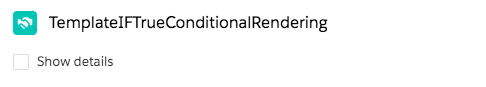
Under Custom Components, find your templateIFTrueExampleLWC component and drag it on right hand side top.
Click Save and activate.
We will get the following Output
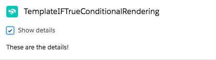
When user select the checkbox, we will see the following output
Let’s see some practical example. In this example, account list is fetched from the database. If there is some error in fetching account list then show error otherwise show account list
AccountHelper.cls
public with sharing class AccountHelper {
    @AuraEnabled(cacheable=true)
    public static List<Account> getAccountList() {
        return [SELECT Id, Name, Type, Rating,
                Phone, Website, AnnualRevenue
            FROM Account];
    }
}
lightning:recordForm Example lightning aura component
lightning:recordForm component allows you to quickly create forms to add, view, or update a record. Using this component to create record forms is easier than building forms manually with lightning:recordEditForm or lightning:recordViewForm. The lightning:recordForm component provides these helpful features:
Switches between view and edit modes automatically when the user begins editing a field in a view form
Provides default Cancel and Save buttons in edit forms
Uses the object’s default record layout with support for multiple columns
Loads all fields in the object’s compact or full layout, or only the fields you specify
lightning:recordForm is less customizable. To customize the form layout or provide custom rendering of record data, use lightning:recordEditForm (add or update a record) and lightning:recordViewForm (view a record).
The objectApiName attribute is always required, and the recordId is required only when you’re editing or viewing a record.
lightning:recordForm implements Lightning Data Service and doesn’t require additional Apex controllers to create or edit record data. It also takes care of field-level security and sharing for you, so users see only the data that they have access to.
Modes
The component accepts a mode value that determines the user interaction allowed for the form. The value for mode can be one of the following:
edit – Creates an editable form to add a record or update an existing one. When updating an existing record, specify the record-id. Edit mode is the default when record-id is not provided, and displays a form to create new records.
view – Creates a form to display a record that the user can also edit. The record fields each have an edit button. View mode is the default when recordId is provided.
readonly – Creates a form to display a record without enabling edits. The form doesn’t display any buttons.
Specifying Record Fields
For all modes, the component expects the fields attribute or the layoutType attribute.
Use the fields attribute to pass record fields as an array of strings. The fields display in the order you list them.
Use the layoutType attribute to specify a Full or Compact layout. Layouts are typically defined (created and modified) by administrators. Specifying record data using layout-type loads the fields in the layout definition. All fields that have been assigned to the layout are loaded into the form.
To see the fields in the layout types in your org:
Full – The full layout corresponds to the fields on the record detail page. From the management settings for the object that you want to edit, go to Page Layouts.
Compact – The compact layout corresponds to the fields on the highlights panel at the top of the record. From the management settings for the object that you want to edit, go to Compact Layouts.
lightning-record-form LWC (Lightning Web Component)
lightning-record-form LWC
lightning-record-form component allows you to quickly create forms to add, view, or update a record. Using this component to create record forms is easier than building forms manually with lightning-record-edit-form or lightning-record-view-form. The lightning-record-form component provides these helpful features:
Switches between view and edit modes automatically when the user begins editing a field in a view form
Provides Cancel and Save buttons automatically in edit forms
Uses the object’s default record layout with support for multiple columns
Loads all fields in the object’s compact or full layout, or only the fields you specify
lightning-record-form is less customizable. To customize the form layout or provide custom rendering of record data, use lightning-record-edit-form (add or update a record) and lightning-record-view-form (view a record).
The object-api-name attribute is always required, and the record-id is required only when you’re editing or viewing a record.
lightning-record-form implements Lightning Data Service and doesn’t require additional Apex controllers to create or edit record data. It also takes care of field-level security and sharing for you, so users see only the data that they have access to.
Modes
The component accepts a mode value that determines the user interaction allowed for the form. The value for mode can be one of the following:
edit – Creates an editable form to add a record or update an existing one. When updating an existing record, specify the record-id. Edit mode is the default when record-id is not provided, and displays a form to create new records.
view – Creates a form to display a record that the user can also edit. The record fields each have an edit button. View mode is the default when record-id is provided.
readonly – Creates a form to display a record without enabling edits. The form doesn’t display any buttons.
Specifying Record Fields
For all modes, the component expects the fields attribute or the layout-type attribute.
Use the fields attribute to pass record fields as an array of strings. The fields display in the order you list them.
Use the layout-type attribute to specify a Full or Compact layout. Layouts are typically defined (created and modified) by administrators. Specifying record data using layout-type loads the fields in the layout definition. All fields that have been assigned to the layout are loaded into the form.
To see the fields in the layout types in your org:
Full – The full layout corresponds to the fields on the record detail page. From the management settings for the object that you want to edit, go to Page Layouts.
Compact – The compact layout corresponds to the fields on the highlights panel at the top of the record. From the management settings for the object that you want to edit, go to Compact Layouts.
import { LightningElement, api } from 'lwc';
import { ShowToastEvent } from 'lightning/platformShowToastEvent';
import NAME_FIELD from '@salesforce/schema/Account.Name';
import REVENUE_FIELD from '@salesforce/schema/Account.AnnualRevenue';
import INDUSTRY_FIELD from '@salesforce/schema/Account.Industry';
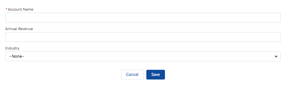
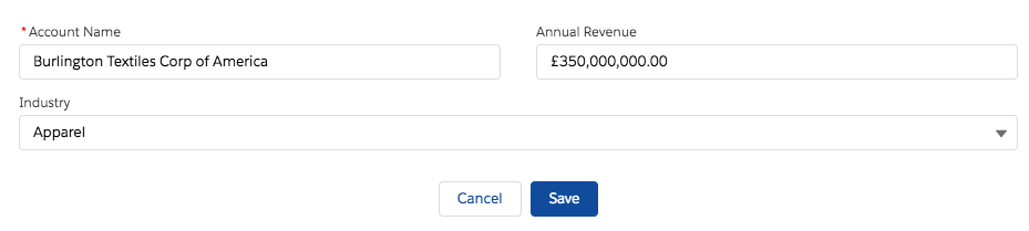
export default class LightningRecordFormCreateExampleLWC extends LightningElement {
// objectApiName is "Account" when this component is placed on an account record page
@api objectApiName;
fields = [NAME_FIELD, REVENUE_FIELD, INDUSTRY_FIELD];
handleSuccess(event) {
const evt = new ShowToastEvent({
title: "Account created",
message: "Record ID: " + event.detail.id,
variant: "success"
});
this.dispatchEvent(evt);
}
}
lightning-record-edit-form LWC (Lightning Web Component)
A lightning-record-edit-form component is a wrapper component that accepts a record ID and object name. It is used to add a Salesforce record or update fields in an existing record. The component displays fields with their labels and the current values and enables you to edit their values. The lightning-input-field component is used inside the lightning-record-edit-form to create editable fields. The lightning-output-field component and other display components such as lightning-formatted-name can be used to display read-only information in your form. lightning-record-edit-form implements Lightning Data Service. It doesn’t require additional Apex controllers to create or update records. Using lightning-record-edit-form to create or update records with Apex controllers can lead to unexpected behaviors. This component also takes care of field-level security and sharing for you, so users see only the data they have access to.
lightning-record-edit-form supports the following features:
Editing a record’s specified fields, given the record ID.
Creating a record using specified fields.
Customizing the form layout
Custom rendering of record data
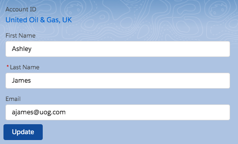
Editing a Record
To enable record editing, pass in the ID of the record and the corresponding object API name to be edited. Specify the fields you want to include in the record edit layout using lightning-input-field.
Include a lightning-button component with type=”submit” to automatically save any changes in the input fields when the button is clicked.
Let’s create an example to edit account record using lightning-record-edit-form in Lightning Web Component
Now we can add this LWC component on the Contact Record page.
Go to Contact record
Click Setup (Gear Icon) and select Edit Page.
Under Custom Components, find your recordEditFormEditExampleLWC component and drag it on Contact Page.
Click Save and activate.
We will get the following output
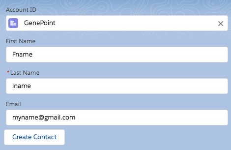
Creating a Record
To enable record creation, pass in the object API name for the record to be created. Specify the fields you want to include in the record create layout using lightning-input-field components. For more information, see the lightning-input-field documentation.
Include a lightning-button component with type=”submit” to automatically save the record when the button is clicked.
Let’s create an example to create account record using lightning-record-edit-form in Lightning Web Component
Now we can add this LWC component on the Contact Record page.
Go to Contact record.
Click Setup (Gear Icon) and select Edit Page.
Under Custom Components, find your recordEditFormCreateExampleLWC component and drag it on Contact Page.
Click Save and activate.
We will get the following output
Displaying Forms Based on a Record Type
If your org uses record types, picklist fields display values according to your record types. You must provide a record type ID using the record-type-id attribute if you have multiple record types on an object and you don’t have a default record type. Otherwise, the default record type ID is used.
Supported Objects
This component doesn’t support all Salesforce standard objects. For example, the Event and Task objects are not supported. This limitation also applies to a record that references a field that belongs to an unsupported object.
External objects and person accounts are not supported.
To work with the User object, specify FirstName and LastName instead of the Name compound field for the field-name values of lightning-input-field.
Error Handling
lightning-record-edit-form handles field-level validation errors and Lightning Data Service errors automatically. For example, entering an invalid email format for the Email field results in an error message when you move focus away from the field. Similarly, a required field like the Last Name field displays an error message when you leave the field blank and move focus away.
We need to include lightning-messages to support error handling and displaying of error messages. If the record edit layout includes a lightning-button component with type="submit", when the button is clicked the lightning-record-edit-form component automatically performs error handling and saves any changes in the input fields. Similarly, if the record create layout provides a submit button, when the button is clicked error handling is automatically performed and a new record is created with the input data you provide.
Lightning Spinner in LWC (Lightning Web Component)
What is Lightning Spinner in LWC?
Lightning Spinners are CSS loading indicators that should be shown when retrieving data or performing slow computations. lightning-spinner displays an animated spinner image to indicate that a request is loading. This component can be used when retrieving data or performing an operation that takes time to complete. In some cases, the first time a parent component loads, a stencil is preferred to indicate network activity.
lightning-spinner LWC example
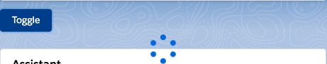
Let’s first see a very simple example to show or hide lightning spinner using a toggle button
import { LightningElement, api } from 'lwc';
export default class LightningSpinnerLWCSimpleExample extends LightningElement {
    @api isLoaded = false;
    // change isLoaded to the opposite of its current value
    handleClick() {
        this.isLoaded = !this.isLoaded;
    }
}
Now we can add this LWC component on the home page.
Go to Home page
Click Setup (Gear Icon) and select Edit Page.
Under Custom Components, find your lightningSpinnerLWCSimpleExample component and drag it on right-hand side top.
Click Save and activate.
We will see the following output. If the user will click on the toggle button then the spinner will toggle on or off.
lightning-spinner example with Apex
Let’s see one more real-life example where the user will click on the button to load account and during apex request lightning spinner loading image
AccountHelper class
public with sharing class AccountHelper {
    @AuraEnabled(cacheable=true)
    public static List<Account> getAccountList() {
        return [SELECT Id, Name, Type, Rating,
                Phone, Website, AnnualRevenue
            FROM Account];
    }
}
Lightning Web component(LWC) can send a toast notification that pops up to alert users of success, error or warning. A toast can also simply provide information. To display a toast notification in Lightning Experience or Lightning communities, import ShowToastEvent from the lightning/platformShowToastEvent module. We can dispatch this toast on some event like click of button.
How to add toast message in Lightning Web component(LWC)
Import Toast Message
import { ShowToastEvent } from 'lightning/platformShowToastEvent';
We can style toast to provide error, success, warning and information message using mode parameter.
We can also configure the visibility of the toast using variant. It can remain visible for three seconds, until the user clicks to dismiss it, or a combination of both.
To trigger a toast from a Lightning web component, in the component’s JavaScript class, import ShowToastEventfrom lightning/platformShowToastEvent.
Create a ShowToastEvent with a few parameters, and dispatch it.
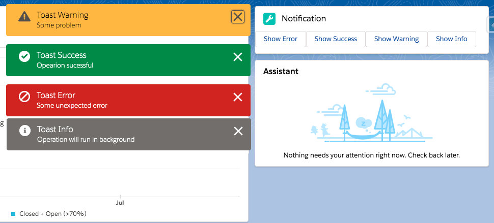
Types of toast messages Lightning Web Component(LWC)
Now we can add this LWC component on the home page.
Go to Home page
Click Setup (Gear Icon) and select Edit Page.
Under Custom Components, find your toastNotificationExampleLWC component and drag it on right-hand side top.
Click Save and activate.
We will get the following output
Here is list of Toast Event Parameters:
PARAMETER
TYPE
DESCRIPTION
title
String
The title of the toast, displayed as a heading.
message
String
A string containing a message for the user.
messageData
String[] or Object
url and label values that replace the {index} placeholders in the message string.
variant
String
The theme and icon displayed in the toast. Valid values are:
info—(Default) A gray box with an info icon.
success—A green box with a checkmark icon.
warning—A yellow box with a warning icon.
error—A red box with an error icon.
mode
String
Determines how persistent the toast is. Valid values are:
dismissable—(Default) Remains visible until the user clicks the close button or 3 seconds has elapsed, whichever comes first.
pester—Remains visible for 3 seconds.
sticky—Remains visible until the user clicks the close button.
Custom labels are custom text values that can be accessed from Aura Component, LWC Component, Apex classes, Visualforce pages. The values can be translated into any language Salesforce supports. Custom labels enable developers to create multilingual applications by automatically presenting information (for example, help text or error messages) in a user’s native language.
To access custom labels in Aura components, use the $Label global value provider. In this post we will see how to use custom label in lightning aura component. If you want to add custom label in lwc please refer Custom Labels In Lightning Web Component(LWC)
Create Custom Labels
Go To Setup — Create — Custom Labels. Click on New Custom Labels. Enter value for name, value and description. We can use custom label name to access custom label value in apex code using System.Label.labelName
The advantage of using a custom label is that label will be displayed to user depending on their language automatically. We need to specify translation for label using translation workbench.
Use Custom Labels in Lightning Aura Component
Use the following syntax to access custom labels in Aura components.
$Label.c.labelName for the default namespace
$Label.namespace.labelName if your org has a namespace, or to access a label in a managed package
Use Custom Labels in Lightning Aura Component javascript controller
Use the following syntax to access custom labels in Aura components.
$A.get(“$Label.c.labelName”) for the default namespace
$A.get(“$Label.namespace.labelName”) if your org has a namespace, or to access a label in a managed package
Custom Label in Lightning Aura Component Example
First, let’s create 3 labels from Setup — Create — Custom Labels. Click on New Custom Labels. Enter value for name, value and description.
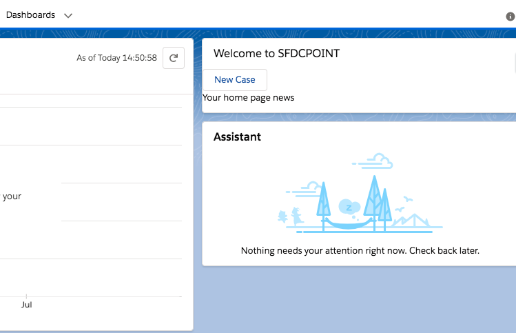
WelcomeNoteLabel: Welcome to SFDCPOINT
HomePageNewsLabel: Your home page news
NewCaseLabel: New Case
We will add two custom labels value in aura component and 3rd custom label value will be added in aura component by setting value to attribute using javascript controller on click of button.
Now create new lightning web component with name customLabelExampleLWC. Here is code
Now we can add this lightning aura component on the home page.
Go to Home page
Click Setup (Gear Icon) and select Edit Page.
Under Custom Components, find your customLabelExampleAura component and drag it on right-hand side top.
Click Save and activate.
User will see custom label values in aura component. When user will click on the New Case button then one more custom label value will be retrieved from aura component controller using attribute. We will get the following output
Custom labels are custom text values that can be accessed from LWC Component, Aura Component, Apex classes, Visualforce pages. The values can be translated into any language Salesforce supports. Custom labels enable developers to create multilingual applications by automatically presenting information (for example, help text or error messages) in a user’s native language.
In this post we will see how to use custom label in LWC component. If you want to add custom label in aura component please refer Custom Labels In Lightning Aura Component
Create Custom Labels
Go To Setup — Create — Custom Labels. Click on New Custom Labels. Enter value for name, value and description. We can use custom label name to access custom label value in apex code using System.Label.labelName
The advantage of using a custom label is that label will be displayed to user depending on their language automatically. We need to specify translation for label using translation workbench.
Use Custom Labels in LWC
Using custom label in LWC is easy. To import a label in a Lightning Web Component JavaScript file, use @salesforce/label in an import statement.
import labelName from '@salesforce/label/label-reference';
labelName: It is name that refers to the label in LWC.
labelReference: The name of the label in your org in the format namespace.labelName. If there is no namespace then simply use labelName.
Custom Labels In Lightning Web Component(LWC) Example
First, let’s create 3 labels from Setup — Create — Custom Labels. Click on New Custom Labels. Enter value for name, value and description.
WelcomeNoteLabel: Welcome to SFDCPOINT
HomePageNewsLabel: Your home page news
NewCaseLabel: New Case
Now create new lightning web component with name customLabelExampleLWC. Here is code
Modal/Popup Lightning Web Component(LWC) Salesforce
In this post, We will simply create a custom Modal/Popup Box in the lightning web component(LWC).
What is Modal in Salesforce Lightning Experience?
Modals/Popup Box are used to display content in a layer above the app. This paradigm is used in cases such as the creation or editing of a record, as well as various types of messaging and wizards.
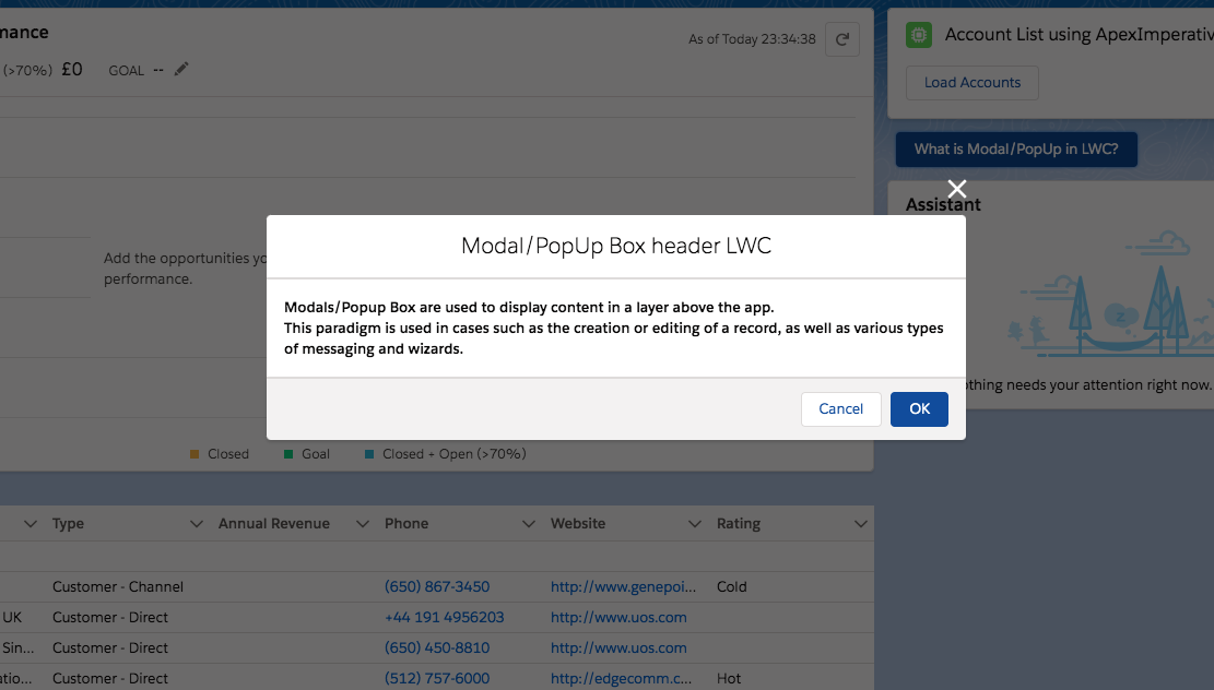
Modal/Popup Lightning Web Component(LWC) Salesforce looks like following image
This post is about creating Modal/Popup in Lightning Web Component(LWC). If you want to know how to create Modal/Popup in Lightning aura component, please refer to Modal/Popup Lightning Component Salesforce
ModalPopup Example Lightning Web component(LWC)
In this code we are first declaring ‘isModalOpen’ attribute and setting its default value as false. Then using template if:true we are conditionally displaying modal/popup on click of button.
Also code has following three main part
section
header
footer
Details are explained in code comment.
Following is expected markup
Expected markup in in modal/popup
Modal has role="dialog"
When the modal is open, everything behind it has HTML attribute aria-hidden="true", so assistive technology won’t read out the underlying page. The best way to do this is to give the modal and the page separate wrapper elements and toggle aria-hidden="true"/aria-hidden="false" on the main page’s wrapper depending on whether or not the modal is open.
Modal contains an HTML heading
Modal has an aria-labelledby attribute whose value is the id of the modal’s heading
modalPopupLWC.html
<template>
    <!-- lightning button for open modal window -->
    <lightning-button variant="brand"
       label="What is Modal/PopUp in LWC?"
       title="What is Modal/PopUp in LWC?"
       onclick={openModal}
       class="slds-m-left_x-small">
    </lightning-button>
    <!--Use template if:true to display/hide popup based on isModalOpen value-->
    <template if:true={isModalOpen}>
        <!-- Modal/Popup Box LWC starts here -->
        <section role="dialog" tabindex="-1" aria-labelledby="modal-heading-01" aria-modal="true" aria-describedby="modal-content-id-1" class="slds-modal slds-fade-in-open">
            <div class="slds-modal__container">
                <!-- Modal/Popup Box LWC header here -->
                <header class="slds-modal__header">
                    <button class="slds-button slds-button_icon slds-modal__close slds-button_icon-inverse" title="Close" onclick={closeModal}>
                        <lightning-icon icon-name="utility:close"
                            alternative-text="close"
                            variant="inverse"
                            size="small" ></lightning-icon>
                        <span class="slds-assistive-text">Close</span>
                    </button>
                    <h2 id="modal-heading-01" class="slds-text-heading_medium slds-hyphenate">Modal/PopUp Box header LWC</h2>
                </header>
                <!-- Modal/Popup Box LWC body starts here -->
                <div class="slds-modal__content slds-p-around_medium" id="modal-content-id-1">
                    <p><b>Modals/Popup Box are used to display content in a layer above the app.
                    </b></p>
                    <p><b>This paradigm is used in cases such as the creation or editing of a record, as well as various types of messaging and wizards.
                    </b></p>
                </div>
                <!-- Modal/Popup Box LWC footer starts here -->
                <footer class="slds-modal__footer">
                    <button class="slds-button slds-button_neutral" onclick={closeModal} title="Cancel">Cancel</button>
                    <button class="slds-button slds-button_brand" onclick={submitDetails} title="OK">OK</button>
                </footer>
            </div>
        </section>
        <div class="slds-backdrop slds-backdrop_open"></div>
    </template>
 </template>
modalPopupLWC.js
import { LightningElement,track } from 'lwc';
export default class ModalPopupLWC extends LightningElement {
    //Boolean tracked variable to indicate if modal is open or not default value is false as modal is closed when page is loaded
    @track isModalOpen = false;
    openModal() {
        // to open modal set isModalOpen tarck value as true
        this.isModalOpen = true;
    }
    closeModal() {
        // to close modal set isModalOpen tarck value as false
        this.isModalOpen = false;
    }
    submitDetails() {
        // to close modal set isModalOpen tarck value as false
        //Add your code to call apex method or do some processing
        this.isModalOpen = false;
    }
}
Under Custom Components, find your modalPopupLWC component and drag it on right-hand side top.
Click Save and activate.
User will see button in home page. After clicking the button user will see popup as shown in image above.
More details about lightning modal/popup
Modals always have an equal amount of space at the top and bottom to account for the height of the close button.
Modals grow according to how much content is within, but once the modal reaches full height (including the previously mentioned space on top and bottom), the content area will begin to scroll. (This scrolling is currently not available in Salesforce1 Mobile.)
For more details about modal in lightning, please refer to modal lightning
We use cookies to ensure that we give you the best experience on our website. If you continue to use this site we will assume that you are happy with it. AcceptRead More
Privacy & Cookies Policy
Privacy Overview
This website uses cookies to improve your experience while you navigate through the website. Out of these, the cookies that are categorized as necessary are stored on your browser as they are essential for the working of basic functionalities of the website. We also use third-party cookies that help us analyze and understand how you use this website. These cookies will be stored in your browser only with your consent. You also have the option to opt-out of these cookies. But opting out of some of these cookies may affect your browsing experience.
Necessary cookies are absolutely essential for the website to function properly. This category only includes cookies that ensures basic functionalities and security features of the website. These cookies do not store any personal information.
Any cookies that may not be particularly necessary for the website to function and is used specifically to collect user personal data via analytics, ads, other embedded contents are termed as non-necessary cookies. It is mandatory to procure user consent prior to running these cookies on your website.


Recent Comments