
lightning-card LWC (Lightning Web Component)
lightning-card LWC (Lightning Web Component)
A lightning-card is used to apply a stylized container around a grouping of information. The information could be a single item or a group of items such as a related list.
Use the variant or class attributes to customize the styling.
A lightning-card contains a title, body, and footer. To style the card body, use the Lightning Design System helper classes.
When applying Lightning Design System classes or icons, check that they are available in the Lightning Design System release tied to your org. The latest Lightning Design System resources become available only when the new release is available in your org.
lightning-card LWC Example
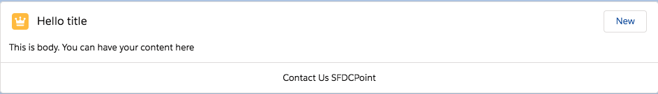
We will create LWC component using lightning-card. We will get the following output
lightningCardLWC.js
<template>
    <lightning-card
            variant="narrow"
            icon-name="standard:opportunity">
        <h1 slot="title">Hello title</h1>
        <p class="slds-p-horizontal_small">This is body. You can have your content here</p>
        <div slot="actions">
            <lightning-button label="New" slot="actions"></lightning-button>
        </div>
        <div slot="footer">
            <p>Contact Us SFDCPoint</p>
        </div>
    </lightning-card>
</template>
lightningCardLWC.js
import { LightningElement } from 'lwc';
export default class LightningCardLWC extends LightningElement {}
lightningCardLWC.js-meta.xml
<?xml version="1.0" encoding="UTF-8"?>
<LightningComponentBundle xmlns="http://soap.sforce.com/2006/04/metadata">
    <apiVersion>48.0</apiVersion>
    <isExposed>true</isExposed>
    <targets>
        <target>lightning__AppPage</target>
        <target>lightning__RecordPage</target>
        <target>lightning__HomePage</target>
    </targets>
</LightningComponentBundle>
Now we can add this lwc component on home page.
- Go to Home page
- Click Setup (Gear Icon) and select Edit Page.
- Under Custom Components, find your lightningCardLWC component and drag it on page.
- Click Save and activate.
Usage Considerations
Icons are not available in Lightning Out, but they are available in Lightning Components for Visualforce and other experiences.
title is available as an attribute or a slot. Pass in the title as a slot if you want to pass in additional markup, such as making the title bold. Or use the title attribute if your title does not need extra formatting. Setting the title attribute overwrites the title slot.
There is one more practical example of using lightning-card, please refer to Lightning Spinner in LWC
For more details please refer to official link
For LWC lightning-card example please refer to this link
1 comment
Hi
I am getting this error while creating contact in lightning page, can u helo me
This page has an error. You might just need to refresh it.
Action failed: c:MyContactComp$controller$CreateNewContact [Cannot read property ‘setParams’ of undefined]
Failing descriptor: {c:MyContactComp$controller$CreateNewContact}
source code : Java script:
CreateNewContact : function(component, event, helper) {
var createContact = $A.get(“e.force:createRecord”);
createContact.setParams({
“entityApiName” : ‘Contact’,
“defaultFieldValues”:{
“contact.Id”:component.get(“v.recordId”),
}
});
createContact.fire();
}
controller: